pavilions residences
Pavilions has reimagined urban life at Sydney Olympic Park, delivering a high-quality solution integral to Sydney Olympic Park Authority’s vision for a revitalised town centre.
Lavish attention has been paid to the welcome-home experience for residents of Pavilions. A colonnade entry adds grandeur, culminating in the evocative ‘Figtree’ sculpture by Jade Oakley.
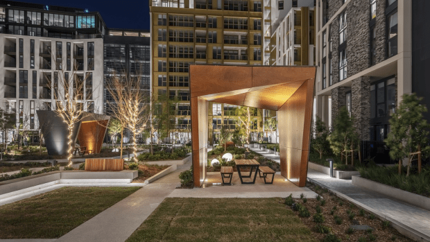
The well-resolved ground plane is a patchwork of individual green spaces for both social interaction and private enjoyment. Landscape architecture by 360 Degrees includes pocket parks, dining pavilions, bocce lawn, kitchen garden and a barbecue area integrated by walkways, soft edges and tree canopies. Viewed from the apartments above, this geometry makes a compelling outlook.
Three preserved Moreton Bay fig trees punctuate the urban design, connecting past and present, resident and community. Two dominate the Australia Avenue frontage, providing canopy for a new public green fringed by 1500sqm of future retail. Another has been carefully relocated south to connect a forthcoming children’s playground and walk/cycle path.
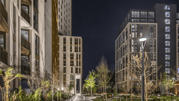
Architecture also engages existing built fabric, including adjacent developments. Pavilions’ highest tower, originally earmarked for 30 storeys, was elevated to 35 storeys to stand up to its neighbour and achieve visual balance at this important gateway position.
Sydney Olympic Park wanted all precinct towers to be slimline – narrower than the floorplates specified for Building 2 (‘Scarlet’). The solution was to align two different forms and façade treatments around a central lift/stairwell core, to give the impression of two individual slim towers.
Meanwhile, in Building 1 (‘Verde’), massing is downplayed via a mansard roof and articulation of every second level, assisted by contrasting light and dark painted soffits.
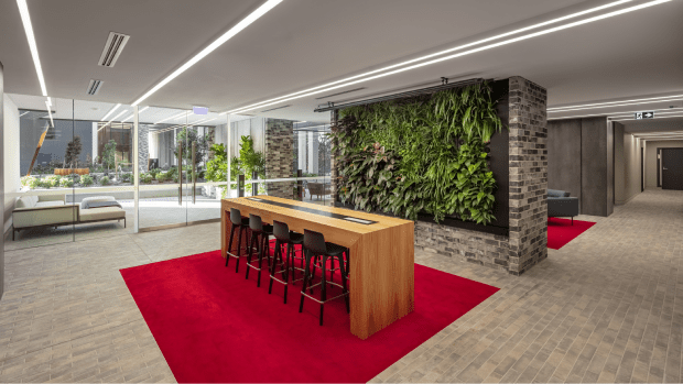
Two of the four new residential buildings were converted to a ‘build-to-rent’ product during development, requiring many iterative design changes. For instance, an enclosed footbridge was added between the two buildings to provide equitable access to the dedicated amenities level in Building 3. The resulting bridge, with its organic curves, subtle slope (to resolve different floor heights) and overall design excellence, greatly enhances the arrival experience for tenant residents and their guests.


